Zet de zomer op je muren: kies trendy pastelkleuren voor een zonnig interieur
Introduction
The allure of summer is undeniable, with its longer days and sunlit spaces brightening our lives. This year, 2026, brings an exciting trend to home decor: incorporating pastel colors into our interiors to capture that bright, summery feel all year round. With their soothing vibes and cheerful tones, pastels are the perfect way to make your home feel sunny and inviting.
Belangrijkste punten
- Pastel colors are back as a major interior design trend for 2026.
- These colors can make any room feel brighter and more uplifting.
- Applying pastels in moderation avoids an overwhelming look.
- They pair well with natural elements like wood and stone.
- Adding pastel details in furniture and accessories also works.
What are pastel colors?
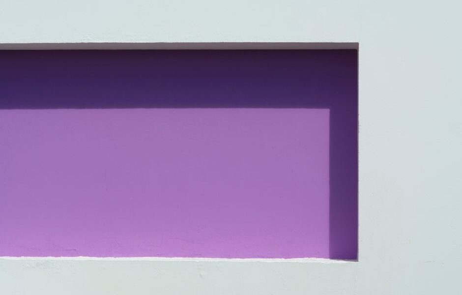
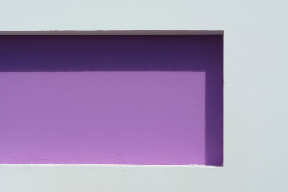
Pastel colors are soft, muted shades that are easy on the eyes and radiate calmness and warmth. Typically, pastels are created by mixing a primary color with white, resulting in lighter hues like soft pinks, baby blues, gentle greens, and lavender shades.
These colors evoke a sense of tranquility and are reminiscent of spring blossoms and clear blue skies, making them an ideal choice for anyone looking to refresh their living space with a hint of summer magic.
Why choose pastel colors for your home?
Choosing pastel colors for your home not only reflects this year’s 2026 trendy palette but also enhances your living space in more ways than one. These soft hues can make rooms appear more airy and spacious, and they help to create serene environments that are conducive to relaxation and peace.
Pastel colors are versatile and work well in almost any room, be it the living room, kitchen, or bedroom. Their subtle nature allows for effortless integration with existing decor, creating harmony rather than overshadowing your other design elements. If you’re considering a minimalistic approach, exploring how a minimalist interior makes your living room more organized and airy can amplify this appeal even further.
Incorporating pastels in the living room
Incorporating pastels into your living room offers a fresh take on a vital communal space. Start with pastel-colored walls or opt for an accent wall in a soft shade like mint green or blush pink to add subtle interest without overwhelming the room.
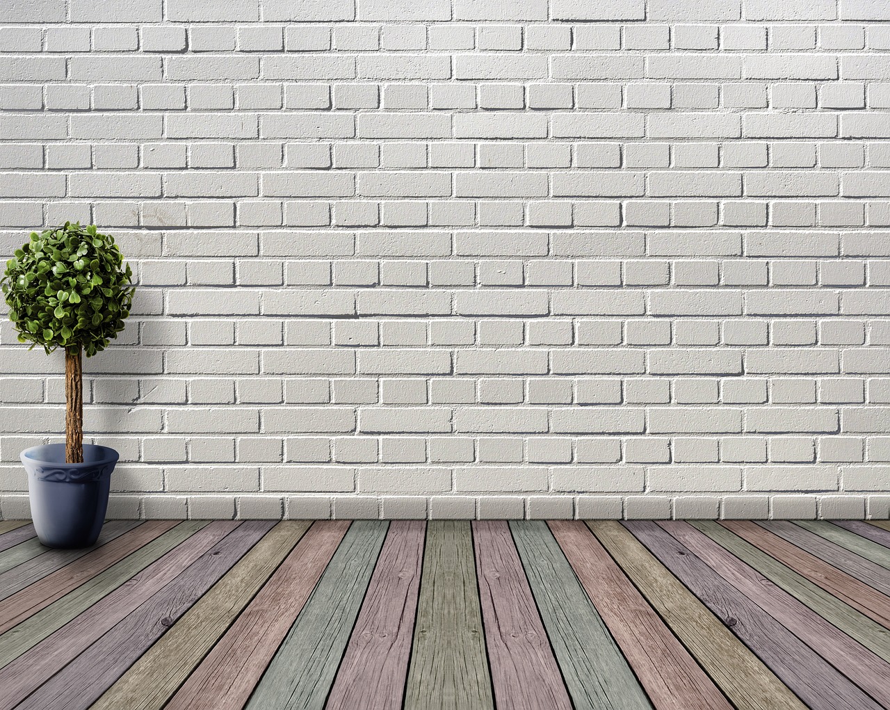
For a softer approach, introduce pastel accents through cushions, rugs, or throws. A pastel-colored sofa or armchair can serve as a striking focal point, effortlessly complementing neutral backdrops. Add natural wood elements to balance pastel hues, achieving a harmonious and inviting ambience.
Pastel colors in the kitchen
Bringing pastel colors into your kitchen can transform it into a cheerful and welcoming space. Start small by incorporating pastel appliances or utensils, which can act as charming accents against a neutral backdrop.
If you prefer a bold change, consider pastel-colored cabinetry or a soft-hued backsplash to breathe life into the heart of your home. Integrating pastels with organized spaces ensures a sense of calm and sophistication. For more inspirations, you can explore why a smartly organized kitchen creates a more serene home environment.
Using pastel shades in the bedroom
A bedroom outfitted with pastel colors invites restfulness and peace, setting the perfect scene for relaxation. Consider painting the walls in a calming pastel blue or peach to create an oasis of tranquility.
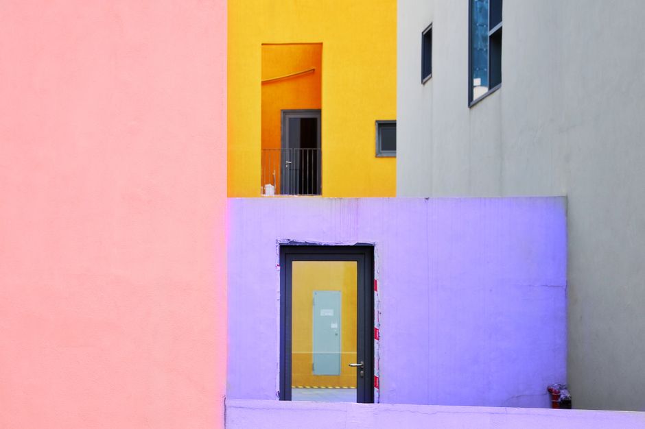
Accentuate with pastel bedding or curtains for a cohesive look that promotes relaxation. Combining pastels with textures like linen or wool ensures comfort and style. Incorporating sustainable materials not only lends an eco-friendly attribute but also enriches the design with grace and timelessness.
Combining pastels with natural materials
Combining pastels with natural materials creates a compelling design that balances softness and grounding. Elements like wood, stone, and rattan paired with pastel shades evoke an organic and warm atmosphere.
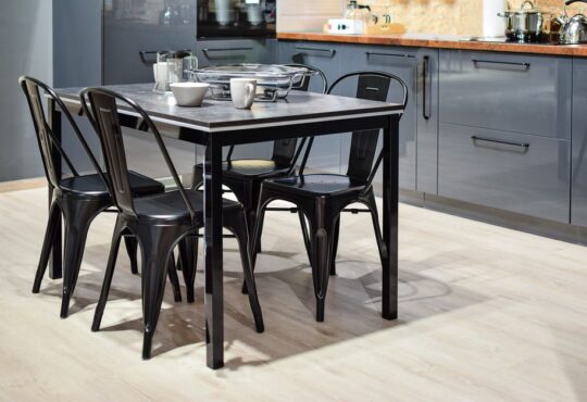
For instance, a wooden dining table surrounded by pastel-colored chairs presents a thoughtful blend of modern and rustic styles. Such combinations pay homage to nature while embracing contemporary aesthetics, ensuring a timeless look that feels both inviting and calming.
Veelgestelde vragen
What are popular pastel colors for 2026?
In 2026, popular pastels include soft pinks, mint greens, and lavender, which are trending for their calming effects and versatility.
How can I avoid an overwhelming look with pastels?
Balance pastels with neutral elements like white or beige, and pair them with natural textures to prevent them from appearing overpowering.
Can pastels be used in small spaces?
Yes, pastel colors are ideal for small spaces as their light-reflective nature can make rooms appear larger and more open.
Are pastel colors only suitable for traditional interiors?
Not at all. Pastel colors are versatile and work well in both traditional and modern interiors, adding a touch of freshness and elegance.
A summery vibe all year round
Transforming your home with pastel colors is a delightful way to maintain a sunny, inviting atmosphere year-round. By carefully selecting pastel shades that complement your existing decor and combining them with natural materials, you create a space that’s both trendy and timeless. This approach ensures a balanced and harmonious environment, inviting relaxation and joy into every moment spent at home.