How do you combine color and texture for a cozy atmosphere
The creation of a comfortable and inviting atmosphere in interior design often relies on a synergistic interplay of color and texture. These two elements, while distinct, function as the warp and weft of a room’s aesthetic fabric, contributing significantly to its perceived warmth and hospitality. Understanding their individual properties and how they interact is fundamental to achieving a truly cozy space.
Color is a powerful psychological tool, capable of influencing mood and perception without explicit communication. In the context of coziness, certain color palettes naturally lend themselves to a sense of warmth and enclosure, often drawing upon natural associations.
Warm vs. Cool Hues
The traditional distinction between warm and cool colors is a primary consideration for coziness.
Warm Color Dominance
Warm colors, such as reds, oranges, and yellows, evoke feelings of sunlight, fire, and human connection. They tend to advance visually, making spaces feel smaller and more intimate. A room predominantly featuring these hues can inherently feel more inviting and less expansive. For example, a deep terracotta wall can suggest the earthy embrace of a sun-drenched landscape, instantly conveying warmth.
Strategic Cool Color Incorporation
While warm colors are central, cool colors—blues, greens, and purples—are not excluded. When used strategically, they can provide balance and depth. A touch of cool blue in textiles, for instance, can introduce a sense of calm and expansive sky, preventing a warm-toned room from feeling stifling. The contrast can also make the warm elements appear richer. A deep forest green accent against a predominantly ochre palette might evoke the feeling of a welcoming cabin nestled within a natural, vibrant environment.
Color Saturation and Lightness
Beyond hue, the saturation and lightness of a color significantly impact its cozy potential.
Muted and Earthy Tones
Highly saturated, bright colors, while stimulating, can sometimes detract from a sense of calm. For coziness, designers often gravitate towards muted and earthy tones. These colors, with lower saturation, are inherently softer and less demanding on the eye. Think of the desaturated hues found in dried leaves, distressed wood, or natural fibers. A muted sage green or a dusty rose can create a soft visual backdrop, contributing to a tranquil and settled feeling.
Deeper and Richer Shades
Darker, richer shades can also contribute profoundly to coziness. A deep navy blue, charcoal gray, or a profound burgundy can envelop a space, much like a comforting blanket. These colors absorb light, contributing to a sense of enclosure and intimacy. In contrast to bright, open spaces, a room with darker walls can feel like a sanctuary. This effect is particularly pronounced in spaces designed for evening use, where the interplay of artificial light with deep colors creates a luxurious and comforting ambiance.
Color Psychology and Emotional Resonance
Beyond optical effects, colors carry learned associations and psychological impacts that shape our perception of comfort.
Colors of Nature
Many cozy palettes draw inspiration from the natural world. The greens of foliage, the browns of earth and wood, the grays of stone, and the soft blues and creams of sky and cloud often feature prominently. These natural tones are inherently calming and provide a sense of groundedness. A room decorated with such colors can evoke the feeling of being nestled within a serene landscape,
fostering relaxation.
Historical and Cultural Associations
Certain colors also carry historical and cultural associations with warmth and comfort. For example, the use of rich jewel tones in historic European interiors often conveys opulence and a sense of enduring comfort. Similarly, the deep reds and oranges in many traditional Eastern textiles are associated with warmth and hospitality. Understanding these nuances can inform color choices for a particular desired aesthetic.
To create a cozy atmosphere in your home, combining color and texture is essential, and understanding the right fabrics can significantly enhance this effect. For a deeper insight into selecting the best materials for your curtains, which play a crucial role in setting the mood, you can refer to this informative article on the best fabrics for curtains in your home. Check it out here: “Best Fabrics for Curtains“.
Exploring Texture’s Influence
Texture, often perceived through sight as well as touch, adds tactile depth and visual interest to a space. It can transform a flat surface into a multi-sensory experience, greatly enhancing the feeling of coziness.
Tactile Textures
The physical feel of a surface is a direct contributor to perceived comfort.
Soft and Plush Materials
Materials that invite touch are highly effective in creating coziness. Consider the allure of a plush velvet sofa, a substantial wool rug, or a collection of chunky knit throws. These items suggest softness, warmth, and an invitation to relax. The sensory experience of running a hand over a soft fabric or sinking into a cushioned surface directly translates to a feeling of comfort and security.
Natural and Organic Elements
The inclusion of natural materials with inherent textures is another cornerstone of cozy design. Wood, stone, linen, cotton, and wool all possess distinct textures that evoke a sense of authenticity and connection to nature. An unpolished wooden table, a stone fireplace, or undyed linen curtains bring an organic rawness that softens a space and grounds it. These materials often feature subtle imperfections that add character and warmth, moving away from a sterile or manufactured feel.
Visual Textures
Even without direct physical contact, texture can be perceived visually, adding depth and interest.
Layering of Fabrics
Layering different fabrics with varying textures is a key technique. A smooth silk cushion placed next to a nubby linen throw, or a sleek leather armchair adorned with a shaggy sheepskin rug, creates a rich tapestry of visual textures. This layering prevents a room from appearing flat and homogeneous, adding complexity and encouraging the eye to explore. Each textile adds another dimension to the visual landscape.
Rough and Smooth Contrasts
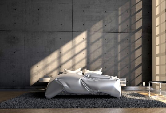
Strategic juxtaposition of rough and smooth textures can heighten the perceived comfort of softer elements. A rustic brick wall provides a rough backdrop against which a soft, upholstered armchair appears even more inviting. The contrast between a smooth polished concrete floor and a thick pile rug enhances the warmth and softness of the rug. This dynamic interplay creates visual interest and emphasizes the comfort of the softer elements.
Materiality and Light Interaction
Texture also significantly affects how light interacts with surfaces, influencing the overall atmosphere.
Light Absorption and Reflection
Matte and textured surfaces tend to absorb light, creating softer shadows and a more diffused, gentle glow. This contributes to a sense of intimacy and reduces harshness. Conversely, glossy or smooth surfaces reflect light, which can sometimes make a space feel brighter and more expansive, but potentially less cozy. For a cozy atmosphere, a preference for light-absorbing textures is generally more effective, as it softens the overall illumination.
Shadow Play and Depth
Textured surfaces create subtle shadow play that adds depth and dimension to a room. The undulations of a woven basket or the uneven grain of wood catch light differently, creating subtle variations that prevent surfaces from appearing flat. This visual depth contributes to a more engaging and comforting environment, making the space feel more lived-in and organic.
Combining Color and Texture Strategically
The true art of creating a cozy atmosphere lies in the intelligent integration of color and texture. They are not merely adjacent elements but interconnected components that amplify each other’s effects.
Establishing a Cohesive Palette
The initial step in combining these elements is to establish a cohesive color palette that aligns with the desired mood of coziness.
Dominant and Accent Colors
Typically, a room will feature one or two dominant colors that establish the overall sense of warmth or calm. These are then complemented by accent colors that provide visual interest and depth. For instance, a dominant palette of creams and subtle browns, evocative of a natural landscape, could be accented with deep rust tones in textiles or artwork. This creates a harmonious base upon which textures can be layered.
Inspiration from Nature
Drawing inspiration directly from nature is a reliable method for developing harmonious palettes. Observe the subtle shifts in color in a forest during autumn, or the gentle undulations of a sandy beach. These natural combinations often present a readymade scheme that feels inherently balanced and calming. Translating these natural inspirations into interior elements ensures an organic and pleasing result.
Layering for Depth and Warmth
Layering is a fundamental technique for combining color and texture to achieve coziness, both visually and physically.
Textiles as Primary Vehicles
Textiles are perhaps the most potent tools for layering. Throws, cushions, rugs, and curtains all offer opportunities to introduce both color and texture. A monochromatic color scheme can be prevented from feeling flat by using textiles of varying textures within that single color range – a smooth velvet cushion next to a chunky knit throw, both in shades of taupe, for example. Conversely, a rich texture like sheepskin can carry a bolder color without overwhelming the space.
Walls and Surfaces
Beyond textiles, the walls and fixed surfaces of a room offer extensive opportunities for textured color. A wall painted in a deep, matte finish can mimic the effect of velvet, absorbing light and creating a sense of enclosure. Wallpaper with a subtle woven pattern or a textured plaster finish can introduce visual tactile interest even before furniture is added. These foundational layers set the stage for subsequent textural additions.
Achieving Balance and Contrast
While the goal is coziness, a lack of contrast can lead to monotony. Strategic contrasts are key to preventing a space from feeling bland.
Contrasting Smooth with Rough
Pair a highly textured, hand-knitted blanket in a warm hue with a smooth, cool-toned ceramic planter. The visual and tactile contrast will make both elements stand out and enhance the overall texture of the room. This dynamic interplay adds visual excitement without sacrificing comfort. Imagine a sleek, dark wood coffee table juxtaposed with a light-colored, shaggy rug – the crispness of the table highlights the softness of the rug.
Playing with Light and Shadow
A deep, textured wall in a warm color, such as a deep plum, can be illuminated with directional lighting. This will reveal the nuances of its texture through shadow, adding depth and drama. The shadows created by textured surfaces contribute to a visually rich environment, making the space feel more complex and inviting, as if there are hidden depths to explore.
Practical Application and Considerations
Moving from theory to practice requires careful consideration of the specific space and its inhabitants.
Room Function and Size
The function and size of a room significantly influence how color and texture are applied.
Small Spaces
In smaller rooms, dominant warm colors and dark hues can sometimes make the space feel oppressive if not balanced appropriately. Here, using warmer, richer hues on accent walls or through layered textiles can provide coziness without shrinking the space excessively. Lighter, more muted colors on the main walls, combined with deeply textured elements, can create warmth without sacrificing perceived spaciousness.
Large Spaces
Larger rooms often present the opposite challenge: preventing them from feeling cavernous or sterile. Here, darker, more saturated colors can be used more liberally on walls to bring the perceived boundaries inward. Abundant use of varied textures across large surfaces like rugs, expansive draperies, and numerous upholstered pieces helps to absorb sound and create visual anchors, contributing to a sense of enclosure and intimacy.
Integrating Existing Elements
Few spaces are built from scratch. Incorporating existing elements is a common challenge.
Harmonizing with Fixed Features
Consider fixed elements like flooring, architectural details, or built-in cabinetry. If a room has richly textured wooden floors, this becomes a foundational texture to work with. If there’s a prominent stone fireplace, its color and texture will guide subsequent choices. The goal is to build upon these existing features rather than fighting against them, creating a harmonious and unified scheme.
Updating with Accessories
Even without major renovations, the strategic use of accessories, such as throws, cushions, artwork, and decorative objects, can dramatically alter a room’s cozy quotient. These are often the easiest and most cost-effective ways to introduce new colors and textures. A collection of hand-thrown pottery or a series of woven wall hangings can transform a cool, uninviting space into a warm and welcoming retreat.
Creating a cozy atmosphere in your home involves not just the right color palette but also the thoughtful integration of texture. To enhance your understanding of how to achieve this, you might find it helpful to explore the article on incorporating sentimental items into home decor. By blending personal touches with your color and texture choices, you can create a space that feels both inviting and uniquely yours. For more insights, check out this related article on incorporating sentimental items into home decor.
The Role of Personal Preference
| Element | Color Suggestions | Texture Suggestions | Effect on Cozy Atmosphere |
|---|---|---|---|
| Walls | Warm neutrals (beige, taupe), soft pastels | Matte or eggshell finish, subtle textured wallpaper | Creates a warm, inviting base that feels soft and comforting |
| Furniture | Earth tones (brown, rust, olive green) | Soft fabrics like velvet, chenille, or suede | Adds tactile warmth and visual depth, encouraging relaxation |
| Textiles (pillows, throws, rugs) | Rich jewel tones (deep reds, navy, mustard) | Knitted, faux fur, chunky weaves, or plush textures | Enhances comfort and visual interest, making space feel snug |
| Lighting | Warm white or amber hues | Soft fabric lampshades, frosted glass | Softens the ambiance, reducing harshness and increasing warmth |
| Decorative Accents | Muted metallics (bronze, copper), natural wood tones | Rough wood, woven baskets, ceramic with texture | Adds organic texture and subtle shine, enhancing coziness |
While general principles apply, the ultimate definition of “cozy” is subjective.
Individual Comfort Zones
What one individual finds cozy, another might find stifling or bland. It is essential to consider the preferences of those who will inhabit the space. Some may prefer brighter, more airy warmth, while others thrive in deeper, more enveloping environments. The combination of color and texture should ultimately resonate with the personal comfort zones of the residents.
Creating a Narrative
A truly cozy space often tells a story. The chosen colors and textures, when thoughtfully combined, can evoke memories, passions, or a desired mood. A collection of textiles from various travels, or colors reminiscent of a childhood home, can infuse a space with personal meaning that transcends mere aesthetics, becoming a deeply personal and comforting haven.
By understanding the individual contributions of color and texture, and by mastering their integrated application, one can transcend superficial decoration and cultivate spaces that resonate with a profound sense of warmth, security, and human comfort. The interaction between a muted, warm color palette and a rich tapestry of tactile surfaces creates an environment that not only pleases the eye but also soothes the spirit, inviting relaxation and repose.
FAQs
1. What colors are best for creating a cozy atmosphere?
Warm colors such as soft reds, oranges, yellows, and earthy tones like browns and beiges are ideal for creating a cozy atmosphere. These colors evoke warmth and comfort, making a space feel inviting and relaxing.
2. How can texture enhance the coziness of a room?
Texture adds depth and tactile interest to a space, making it feel more layered and comfortable. Incorporating materials like plush rugs, knitted throws, velvet cushions, and wooden furniture can create a warm and inviting environment.
3. Should color and texture be matched or contrasted for a cozy look?
Both matching and contrasting color and texture can work, but a balanced approach is best. Using complementary colors with varied textures can create visual interest without overwhelming the space, contributing to a cozy and harmonious atmosphere.
4. What role does lighting play when combining color and texture for coziness?
Lighting significantly affects how colors and textures are perceived. Soft, warm lighting enhances warm colors and highlights textures, making the space feel more intimate and cozy. Avoid harsh, bright lights that can diminish the cozy effect.
5. Can natural elements be used to combine color and texture for coziness?
Yes, natural elements like wood, stone, plants, and natural fibers add both color and texture that contribute to a cozy atmosphere. These elements bring warmth and organic textures that complement warm color palettes effectively.